Focusable element's state correct
Some elements in your app might not be telling the truth.
A button announces "Selected, Save, Button". Sounds plausible — but a button is not expected to have a state.
People who rely on assistive technologies depend on the combination of role and state to understand how an element behaves. A state assigned to the wrong role sends a mixed signal: users may try to toggle something that is not a toggle, or look for a way to collapse something that is not supposed to be expandable.
To catch these mismatches automatically, we are introducing a new rule in Abra Desktop and Abra SDK: Focusable element state correct.
Available for Android and iOS apps built with SwiftUI, Jetpack Compose, Flutter, React Native and .NET MAUI.
The programmatically determined state
Assistive technologies such as screen readers rely on the state exposed through the accessibility layer of the operating system.
Developers define this state through properties such as isChecked and stateDescription on Android, or accessibilityTraits and accessibilityValue on iOS.
States typically indicate binary or categorical conditions. Some roles are expected to expose specific states, for example:
A checkbox:
checkedorunchecked.A switch:
onoroff.A tab:
selectedornot selected.A disclosure element:
expandedorcollapsed.
Other roles, such as Button or Image, are not expected to expose these states. The role determines which states are valid for an element — that is why a correct role comes first.
Present vs. correct
Our earlier rule, Focusable element state present, checks whether elements that need a state expose one at all.
For example, in an Android app, a custom checkbox is visually shown as selected, but its state is not programmatically exposed. TalkBack announces the name and role, but not whether it is checked.
 But what about elements that expose a state their role is not expected to have?
In an iOS app, a dark mode switch is built as a button with a checked state. VoiceOver announces "Checked, Dark mode, Button" — but a button is not expected to have a checked state. The element needs the Switch role.
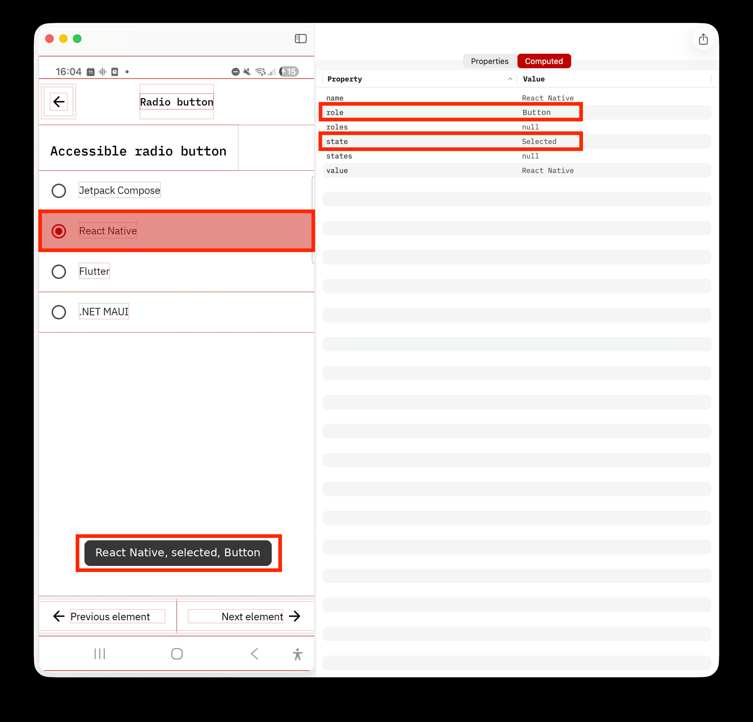
In an Android app, the active item in a tab bar is built as a button with
isSelectedset totrue. TalkBack announces "Selected, Home, Button" — but a button is not expected to have a selected state.
In both examples, the combination of role and state is incorrect. The new Focusable element state correct rule checks whether the exposed state is valid for the element's role — and flags the combinations that do not add up.
The rule applies to all focusable elements with a programmatically determinable state.
Why manual testing misses this
A manual tester navigates the app with a screen reader and reports what they hear. If the announcement sounds reasonable, the element often passes.
But the announcement alone does not always reveal whether the underlying accessibility properties are correct.
Take this example: a screen reader announces "Selected, Home, Tab, 1 of 4". A manual auditor would pass it — the announcement is exactly what a tab should sound like. But an automated test shows that the whole announcement is included in the accessible name, while the role, state and value properties are empty. One property is doing the job of four. Manually, this issue is impossible to catch.
Abra removes this guesswork. Instead of relying only on screen reader announcements, Abra extracts accessibility information directly from the Android and iOS accessibility layer. It validates name, role, state and value independently — and checks whether they are consistent with each other. If the state is missing or not valid for the role, Abra flags it.
Compliance: WCAG and EN 301 549
The Focusable element state correct rule maps to WCAG 2.2 Success Criterion 4.1.2 Name, Role, Value, which requires that states of user interface components can be programmatically determined.
This criterion is referenced in EN 301 549, the European accessibility standard commonly used to assess compliance with the European Accessibility Act (EAA).
Catch common accessibility issues automatically
In many of our mobile accessibility audits, we find issues that Abra's automated rules detect. With a few clicks, you can test a screen against all of them:
For everything that automation cannot cover, Abra includes almost 100 manual rules. Together, they let you report the remaining issues and produce a complete audit report demonstrating compliance with WCAG and EAA.
Get started with Abra
Want to make sure all elements in your app always tell the truth?
Contact us to start a free trial or schedule a demo. During the demo, we will show which accessibility issues Abra detects in your app.
Further reading
-
Focusable element's role correct
Some elements in your app may have an identity crisis. Read more »
-
Focusable element's name correct
What you see is not always what a screen reader announces. Read more »
-
Focusable element's value correct
Some elements in your app might be giving the wrong answers. Read more »