What are Accessibility Design Annotations and why do they matter?
A designer creates a beautiful interface with accessibility in mind. The designer considered different important aspects like: color contrast, touch target size and a logical focus order. The design gets handed off to development, and weeks later, the finished product launches... only to fail basic accessibility tests. What went wrong?
The answer might lie in a critical missing piece in the hand off between the design and development team: accessibility design annotations.
These annotations can be seen as a bridge between the visual design and the implementation. They can be seen as a set of (specific) instructions that communicate non-visual requirements, interaction patterns and assistive technology needs that can't be inferred from mock-ups alone. Without them, a part of the implementation is still left to the developer and his interpretation of the design.
In this blog, we'll explore what accessibility design annotations are, why they're essential and how to incorporate them in your design process.
What are design annotations?
Accessibility design annotations are detailed specifications that document how non-visual requirements like: content structure and dynamic behavior should be implemented. Where traditional design specifications focus on the visual properties like: colors, spacing and typography accessibility annotations capture the invisible layer of the requirements.
How do they differ from common design specs?
Standard design patterns might specify:
Button: 16px padding,
#C60000background, border-radius 4px
Where accessibility design annotations add critical information like:
Button focus state: 2px solid outline with 3:1 contrast against background
Keyboard interaction: Activates with Enter and Space keys
Loading state: Announce 'Submitting, please wait' to assistive technology
Why design annotations matter?
The WebAIM Million annual report consistently identifies common accessibility failures across the web's most visited sites, including missing alternative text, insufficient color contrast and missing form labels.
Many of these issues, such as images without alt text or color choices often originate from incomplete design specifications rather than coding errors. When accessibility requires aren't explicitly documented, developers may not know these elements need to be addressed.
When these requirements aren't explicitly documented, developers must either:
Make assumptions (requires accessibility knowledge to do properly).
Spend time researching and deciding (might result in inconsistent implementation company wide).
Skip accessibility considerations entirely.
Depending on the know-how within your company most of these outcomes don't serve your users or your team well.
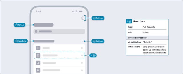
What should be annotated?
Now that we understand the importance, we need to figure out what to annotate. Below we share a list of categories that can benefit from annotation information:
Interactive elements
Keyboard navigation
Button states
Semantic structure
Error messages


How to create effective annotations?
Audit your design for interactive elements. Begin by identifying everything a user can interact with a few examples are: buttons, links form inputs.
Identify non-visual information needs. What information is conveyed only through visual means? Color coding, icon meanings, spatial relationships and visual hierarchy all need text or semantic markup.
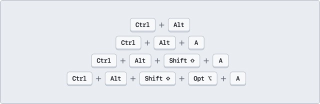
Document keyboard interactions. Which elements receive focus, and in what order? What happens when users press Enter, Space or arrow keys? Are there any keyboard shortcuts.
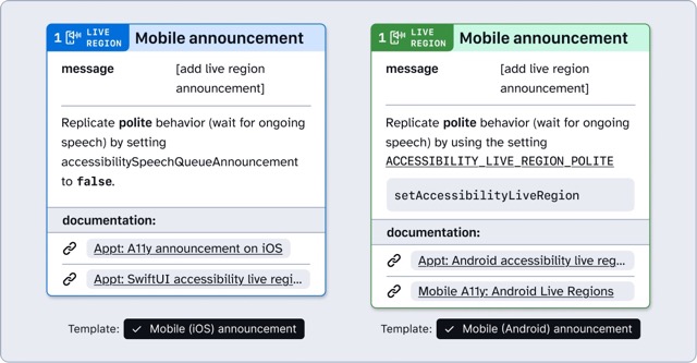
Specify focus management. For dynamic interactions like opening modals or expanding accordions, document where focus should move. When a modal opens, focus typically moves to the modal. When it closes, focus returns to the trigger button.
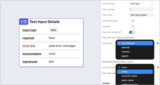
Define error handling and feedback. For every form, interaction or process, consider what can go wrong and how users will be informed. Document error messages, validation timing (on blur vs on submit), and success confirmations.
Best practices
Be specific and actionable
Button focus state: 2px solid red outline (
#C60000), ensure 3:1 contrast against white background.
Use consistent terminology
Establish a shared vocabulary with your development team.
Include rationale when helpful
Sometimes explaining why helps developers make better decisions e.g. "Focus trap within modal (prevents keyboard users from moving focus to elements in the background)".
Common pitfalls
Over-annotating vs. under-annotating
Using vague language
Instead of "works with keyboard" specify how.
Assuming developer knowledge
The difference between decorative and informative images
Forgetting edge cases and error states
It is easy to annotate the "happy path" and forget empty states, loading and / or disabled states.
Making annotations part of your workflow
When to annotate
Start adding accessibility annotations right from the start, not as an afterthought just before the hand-off. This approach:
Catches accessibility issues while they are easy to fix
Informs design decision with implementation reality
Reduces last-minute scrambling
Treat annotation as an ongoing activity. Add annotations as you design, refine them during reviews, and finalize them before hand off.
Who is responsible
Designers own the initial accessibility intent and should document their decisions. This includes:
Visual accessibility (contrast, focus indicators, touch targets)
Content hierarchy and structure
User flow and interaction patterns
Collaboration is key, work with:
Developers to ensure annotations are technically accurate and implementable.
Accessibility specialists for complex requirements or WCAG interpretation.
QA teams to confirm annotations translate to testable criteria.
Design annotations for accessibility are more than just documentation. They are the essential communication layer that ensures inclusive intent becomes inclusive reality. By explicitly specifying focus states, keyboard interactions, semantic structure and assistive technology requirements, annotations bridge the gap between what designers envision and what developers build.
Resources and next steps
Want to learn more about accessibility design annotations and inclusive design practices? Here are some valuable resources:
Need help auditing your mobile apps? Our team specializes in comprehensive accessibility audits that not only identify issues but also provide actionable guidance on how to resolve those issues.
Further reading
-
Capture Android and iOS accessibility hierarchy using Abra snapshots
Browser DevTools make web accessibility inspection easy. Chrome, Firefox, and Safari all let you inspect the accessibility tree of any website. With mobile apps, we don't have that luxury. Read more »
-
Practical guide to mobile accessibility testing
If you are a developer, designer, tester, auditor or any other professional already working on accessibility but unsure how to approach mobile accessibility testing by hand, this guide is for you. Read more »
-
Introducing semi-automated testing in Abra: combine smart automation with expert knowledge
At Abra, we believe real progress comes from combining smart automation with in-depth knowledge. That’s why we’ve introduced a powerful new feature in our desktop tool and dashboard: semi-automated testing. Read more »